Box shadow css beautiful examples. Inner Shadows in CSS
A shadow under a block element on a page is usually used to create a three-dimensional effect, to draw attention to the element, or as part of a design. A small shadow under the elements also gives the page volume and depth.
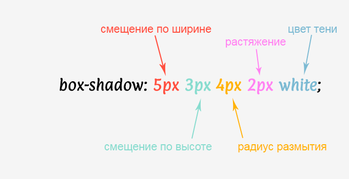
To add a shadow, use the box-shadow property, which has six values, only two of which are required. In Fig. Figure 1 shows the box-shadow property with all possible values, numbered to identify them.
Rice. 1. Box-shadow property values
- the inset keyword sets the shadow inside the element;
- shift the shadow horizontally (5px - right, -5px - left);
- vertical shift (5px - down, -5px - up);
- shadow blur radius (0 - sharp shadow);
- shadow stretch (5px - stretch, -5px - shrink);
- shadow color.
It is necessary to specify only the horizontal and vertical shift; all other parameters will be taken by default. In this case, the shadow will be sharp without blur and black color.
By combining different parameters and their values, you can get a wide variety of types of shadows. In table 1 shows the code and the result it leads to.
| Code | Result | Description |
|---|---|---|
| box-shadow: 5px 5px; | Sharp shadow on the right and below. | |
| box-shadow: -5px -5px; | Sharp shadow on the left and above. | |
| box-shadow: 0 0 5px; | Blurred shadow around an element. | |
| box-shadow: 0 0 5px 2px; | Expand the shadow by 2 pixels. | |
| box-shadow: 0 0 5px 2px red; | Red glow around the element. | |
| box-shadow: 0.4em 0.4em 5px rgba(122,122,122,0.5); | Translucent shadow. | |
| box-shadow: inset 0 0 6px; | Shadow inside. |
As can be seen from the table, the shadow shift does not have to be specified in pixels, although this is convenient. The shadow color can be specified in any available format, so for obtaining a translucent shadow it is suitable RGBA format, such a shadow will look good against any background. Example 1 shows how to do this.
Example 1: Shadow on a background picture
HTML5 CSS3 IE 9+ Cr Op Sa Fx
Do not go against the enemy’s banners when they are in perfect order; do not attack the enemy’s camp when it is impregnable; this is change management.
Sun Tzu, trans. Nikolai Konrad
The result of this example is shown in Fig. 2. The shadow follows the rounding of the corners of the block.

Rice. 2. Appearance of shadow on the background picture
When adding a "wide" shadow, be aware that it may extend beyond the visible borders of the browser window and thus result in a horizontal scrollbar appearing.
Shadows can also be added to pseudo-elements; this is sometimes required for complex layouts. In Fig. Figure 3 shows a header block with a shadow added to it. To avoid any lines at the junction, you have to use the ::after pseudo-element and add a shadow to it.

Rice. 3. Block with shadow
Example 2 shows the creation of such a block.
Example 2. Block with shadow
HTML5 CSS3 IE 9+ Cr Op Sa Fx
Heading
An element can have more than one shadow, but several at once; their parameters are listed separated by commas in the value of the box-shadow property. Example 3 shows how to add a double shadow to all images.
Example 2. Block with shadow
HTML5 CSS3 IE 9+ Cr Op Sa Fx

The result of this example is shown in Fig. 4.

Rice. 4. Double Shadow Image
The first shadow is displayed to the left of the image with a blur radius of 20px, its size reduced by the fourth parameter (-20px). The parameters of the second shadow are indicated after the decimal point; the shadow is displayed to the right of the picture and is also reduced for symmetry.
Hello, dear readers. Today we will do with you beautiful shadow for blocks when CSS help . I think this will be very useful to you, especially if you make templates. And blocks with shadows look very attractive and modern.
Browser support
Basically all modern browsers support shadow effects:
- Internet Explorer 9.0 and higher;
- Firefox 3.5 and higher;
- Chrome 1 and higher;
- Safari 3 and above;
- Opera 10.5 and higher.
I would also like to mention one important point: for some browsers we will use certain prefixes. Used for Firefox -moz-, for Chrome and Safari you need to use the prefix -webkit.
Well, now let's move on to the most interesting part. Let's look at all the shadows separately, there will be 8 effects.
Shadow effect 1

In this example, the shadow of the block is at the bottom.
HTML
Effect 1
CSS
text-align:center; position:relative; top:80px; ) .box ( width:70%; height:200px; background:#FFF; margin:40px auto; ) /*========= ========================= * Effect 1 * ==================== ===========================*/ .effect1( -webkit-box-shadow: 0 10px 6px -6px #777; -moz- box-shadow: 0 10px 6px -6px #777; box-shadow: 0 10px 6px -6px #777;Shadow effect 2

In this example, the shadow from the block goes to the left and right, but there is none in the middle. It turns out to be a very interesting effect.
HTML
Effect 2
CSS
.box h3( text-align:center; position:relative; top:80px; ) .box ( width:70%; height:200px; background:#FFF; margin:40px auto; ) /*====== =========================================================== * Effect 2 * == ============================================================*/ .effect2 ( position: relative; .effect2:before, .effect2:after ( z-index: -1; position: absolute; content: ""; bottom: 15px; left: 10px; width: 50%; top: 80%; max -width:300px; background: #777; -webkit-box-shadow: 0 15px 10px #777; -moz-box-shadow: 0 15px 10px #777; : rotate(-3deg); -moz-transform: rotate(-3deg); -ms-transform: rotate(-3deg); effect2:after ( -webkit-transform: rotate(3deg); -moz-transform: rotate(3deg); -o-transform: rotate(3deg); -ms-transform: rotate(3deg); transform: rotate(3deg) ; right: 10px; left: auto )Shadow effect 3

Here the shadow from the block is only on the left.
HTML
Effect 3
CSS
.box h3( text-align:center; position:relative; top:80px; ) .box ( width:70%; height:200px; background:#FFF; margin:40px auto; ) /*====== =========================================================== * Effect 3 * == ============================================================*/ .effect3 ( position: relative; .effect3:before ( z-index: -1; position: absolute; content: ""; bottom: 15px; left: 10px; width: 50%; top: 80%; max-width:300px; background: #777; -webkit-box-shadow: 0 15px 10px #777; -moz-box-shadow: 0 15px 10px #777; -webkit-transform: rotate(-3deg) ); -moz-transform: rotate(-3deg); -o-transform: rotate(-3deg);Shadow effect 4

Shadow on the right.
HTML
Effect 4
CSS
.box h3( text-align:center; position:relative; top:80px; ) .box ( width:70%; height:200px; background:#FFF; margin:40px auto; ) /*====== =========================================================== * Effect 4 * == =============================================================*/ .effect4 ( position: relative; .effect4:after ( z-index: -1; position: absolute; content: ""; bottom: 15px; right: 10px; left: auto; width: 50%; top: 80%; max- width:300px; background: #777; -webkit-box-shadow: 0 15px 10px #777; -moz-box-shadow: 0 15px 10px #777; rotate(3deg); -moz-transform: rotate(3deg); -ms-transform: rotate(3deg);Shadow effect 5

In this case, the shadow on both sides has moved downwards more strongly.
HTML
Effect 5
CSS
.box h3( text-align:center; position:relative; top:80px; ) .box ( width:70%; height:200px; background:#FFF; margin:40px auto; ) /*====== =========================================================== * Effect 5 * == ============================================================*/ .effect5 ( position: relative; .effect5:before, .effect5:after ( z-index: -1; position: absolute; content: ""; bottom: 25px; left: 10px; width: 50%; top: 80%; max -width:300px; background: #777; -webkit-box-shadow: 0 35px 20px #777; -moz-box-shadow: 0 35px 20px #777; : rotate(-8deg); -moz-transform: rotate(-8deg); -ms-transform: rotate(-8deg); effect5:after ( -webkit-transform: rotate(8deg); -moz-transform: rotate(8deg); -o-transform: rotate(8deg); -ms-transform: rotate(8deg); transform: rotate(8deg) ; right: 10px; left: auto )Shadow effect 6

Here is the effect of curved shadows at the bottom of the block.
HTML
Effect 6
CSS
.box h3( text-align:center; position:relative; top:80px; ) .box ( width:70%; height:200px; background:#FFF; margin:40px auto; ) /*====== =========================================================== * Effect 6 * == ============================================================*/ .effect6 ( position:relative; -webkit-box-shadow:0 1px 4px rgba(0, 0, 0, 0.3), 0 0 40px rgba(0, 0, 0, 0.1) inset; rgba(0, 0, 0, 0.3), 0 0 40px rgba(0, 0, 0, 0.1) inset; box-shadow:0 1px 4px rgba(0, 0, 0, 0.3), 0 0 40px rgba(0 , 0, 0, 0.1) inset; ) .effect6:before, .effect6:after ( content:""; position:absolute; z-index:-1; -webkit-box-shadow:0 0 20px rgba(0, 0,0,0.8); -moz-box-shadow:0 0 20px rgba(0,0,0,0.8); box-shadow:0 0 20px rgba(0,0,0,0.8); ; bottom:0; left:10px; -moz-border-radius:100px / 10px; .effect6:after ( right:10px; left:auto; -webkit-transform :skew(8deg) rotate(3deg); -moz-transform:skew(8deg) rotate(3deg); -ms-transform:skew(8deg) rotate(3deg); -o-transform:skew(8deg) rotate(3deg); transform:skew(8deg) rotate(3deg); )Shadow effect 7

The same effect only with a shadow below and above the block.
HTML
Effect 7
CSS
.box h3( text-align:center; position:relative; top:80px; ) .box ( width:70%; height:200px; background:#FFF; margin:40px auto; ) /*====== =========================================================== * Effect 7 * == ============================================================*/ .effect7 ( position:relative; -webkit-box-shadow:0 1px 4px rgba(0, 0, 0, 0.3), 0 0 40px rgba(0, 0, 0, 0.1) inset; rgba(0, 0, 0, 0.3), 0 0 40px rgba(0, 0, 0, 0.1) inset; box-shadow:0 1px 4px rgba(0, 0, 0, 0.3), 0 0 40px rgba(0 , 0, 0, 0.1) inset; ) .effect7:before, .effect7:after ( content:""; position:absolute; z-index:-1; -webkit-box-shadow:0 0 20px rgba(0, 0,0,0.8); -moz-box-shadow:0 0 20px rgba(0,0,0,0.8); box-shadow:0 0 20px rgba(0,0,0,0.8); bottom:0; left:10px; right:10px; -moz-border-radius:100px / 10px; .effect7:after (right:10px; left:auto; -webkit-transform: skew(8deg) rotate(3deg); -moz-transform:skew(8deg) rotate(3deg); -ms-transform:skew(8deg) rotate(3deg); -o-transform:skew(8deg) rotate(3deg); transform:skew(8deg) rotate(3deg); )Shadow effect 8

The effect of curved shadows on the sides of the block.
HTML
Effect 8
CSS
.box h3( text-align:center; position:relative; top:80px; ) .box ( width:70%; height:200px; background:#FFF; margin:40px auto; ) /*====== =========================================================== * Effect 8 * == ============================================================*/ .effect8 ( position:relative; -webkit-box-shadow:0 1px 4px rgba(0, 0, 0, 0.3), 0 0 40px rgba(0, 0, 0, 0.1) inset; rgba(0, 0, 0, 0.3), 0 0 40px rgba(0, 0, 0, 0.1) inset; box-shadow:0 1px 4px rgba(0, 0, 0, 0.3), 0 0 40px rgba(0 , 0, 0, 0.1) inset; ) .effect8:before, .effect8:after ( content:""; position:absolute; z-index:-1; -webkit-box-shadow:0 0 20px rgba(0, 0,0,0.8); -moz-box-shadow:0 0 20px rgba(0,0,0,0.8); box-shadow:0 0 20px rgba(0,0,0,0.8); bottom:10px; left:0; right:0; -moz-border-radius:100px / 10px; border-radius:100px / 10px ) .effect8:after ( right:10px; left:auto; -webkit-transform: skew(8deg) rotate(3deg); -moz-transform:skew(8deg) rotate(3deg); -ms-transform:skew(8deg) rotate(3deg); -o-transform:skew(8deg) rotate(3deg); transform:skew(8deg) rotate(3deg); )That's all, dear friends. If you don’t understand anything, be sure to ask in the comments. See you soon.
Same as Update 3, but with modern css rules(= less) so that no special positioning is required on the pseudo-element.
#box ( background-color: #3D6AA2; width: 160px; height: 90px; position: absolute; top: calc(10% - 10px); left: calc(50% - 80px); ) .box-shadow:after ( content:""; width:100%; z-index:-1; box-shadow: 0px 8px 2px #000000;
UPDATE 3
#box ( background-color: #3D6AA2; width: 160px; height: 90px; margin-top: -45px; margin-left: -80px; position: absolute; top: 50%; left: 50%; ) .box- shadow:after ( content: ""; width: 150px; height: 1px; margin-top: 88px; margin-left: -75px; display: block; position: absolute; left: 50%; z-index: -1; -webkit-box-shadow: 0px 0px 8px 2px #000000; -moz-box-shadow: 0px 0px 8px 2px #000000; box-shadow: 0px 0px 8px 2px #000000;
UPDATE 2
Apparently you can only do this with the optional CSS box tag option, as everyone else just specified. Here's the demo:
Webkit-box-shadow: 0 4px 4px -2px #000000; -moz-box-shadow: 0 4px 4px -2px #000000; box-shadow: 0 4px 4px -2px #000000;
It would be the best solution. Additional parameter which is added is described as:
The fourth length is the spread distance. Positive values cause the shadow shape to expand in direction along the specified radius. Negative values cause the shadow shape to agree.
UPDATE
What I did was create a "shadow element" that would hide behind the actual element you would like to have in the shadow. I made the width of the "shadow element" exactly less wide than the actual element, 2 times the specified shadow; then I aligned it correctly.
#wrapper ( width: 84px; position: relative; ) #element ( background-color: #3D668F; height: 54px; width: 100%; position: relative; z-index: 10; ) #shadow ( background-color: # 3D668F; height: 8px; margin-left: -40px; bottom: 0px; z-index: 5; moz-box-shadow: 0px 2px 4px #000000; box-shadow: 0px 2px 4px #000000;
Original answer
Yes, you can do this with the same syntax you provided. The first value controls horizontal positioning, and the second value controls vertical positioning. So just set the first value to 0px and the second to whatever offset you would like to make as follows.
With the advent of the standard CSS 3 introduced the box-shadow property, which has become widely used among web developers, as it makes it easy to add one or more shadows to an element's box to give the desired visual effect.
In the previous article, we looked at the border-radius property; using it, you can get a shadow with rounded corners. By analogy with a text shadow (text-shadow), you can create multiple shadows, they are applied according to z-axis front to back (with the first given shadow on top).
Let's take a closer look at the syntax of this modern property:

Let's look at it in order possible values this property:
| Meaning | Description |
|---|---|
| none | The shadow is not displayed. This is the default value. |
| inset | Optional value. If this value is not specified (the default), the shadow will be on the outside of the element and will create the effect of the element being bulged. If the inset keyword (value) is present, the shadow will fall inside the element and create a dented effect. In other words, it is a change from an outer shadow to an inner one. |
| h-shadow | Required value. Sets the location of the horizontal shadow. Negative values are allowed. |
| v-shadow | Required value. Sets the location of the vertical shadow. Negative values are allowed. |
| blur-radius | Optional value. Sets the blur radius. The higher the value, the greater the blur, making the shadow larger and lighter. If the value is not specified, the value will be 0 (sharp - distinct shadows). Negative values are not allowed. |
| spread-radius | Optional value. Shadow size (shadow stretch radius). With positive values the shadow will expand, and with negative values it will shrink. If no value is specified, the value will be 0 (the shadow corresponds to the size of the element). |
| color | Optional value. Defines the color of the shadow (HEX, RGB, RGBA, HSL, HSLA, "Predefined colors"). The default value is black. |
The main points you need to understand to create shadows for elements are:
I would like to draw your attention to the fact that the box-shadow property is currently supported by all modern browsers:
| Property | Opera | IExplorer | Edge |
|||
|---|---|---|---|---|---|---|
| box-shadow | 10.0 4.0 -webkit- | 4.0 3.5 -moz- | 10.5 | 5.1 3.1 -webkit- | 9.0 | 12.0 |
If you want to expand support for some browsers, including mobile iOS 3.2 - 4.3 And Android 2.1 - 3, then it is recommended to use manufacturer prefixes and use the following syntax (in the examples in the article, the syntax will only be used for modern browsers):
-webkit-box-shadow : value ; /* Safari 3.1 - 4, IOS 3.2 - 4.3 and Android 2.1 - 3 */-moz-box-shadow : value ; /* Firefox 3.5 - 3.6 */ box-shadow : value ; /* table above */Let's move on to practice and start with simple example, in which we add one shadow to the elements:
The result of our example:
Using Multiple Shadows
In the following example, I propose to consider the interesting color mixing effect that can be achieved when using multiple shadows:
- Two blocks of fixed width and height (15em and 10em), added margins on all sides (2em) and set the blocks to be block-line to be able to line them up.
- For first block with class .test we indicated four shadows with different horizontal and vertical shadow values so that the element has different shadows on all sides. The blur radius for all shadows was set to the same. The color of each shadow is different and is specified using predefined colors.
- For second block with class .test2 we indicated four shadows with different horizontal and vertical shadow values. The blur radius for all shadows was set to the same, while the shadow stretch was set to negative, which led to a decrease in the shadow itself. The color of each shadow is different and is specified using the RGBA system.
The result of our example:
Using shadows for images
The final example of this article will focus on using shadows for images. I would like to immediately draw your attention to the fact that directly indicate the shadow for HTML element It won’t work, but we have the opportunity to specify an image as the background for the element we are interested in, and then assign the shadow we need to this element.
We will look at working with background images in detail in the textbook article "", and now, to put an end to the study of using shadows, we will touch on it superficially and use the image as a background to an element in the following example:
- Two blocks of fixed width and height (237px and 232px), added margins for all sides (2em) and set the blocks to be block-line to be able to line them up. We set the block size 237px by 232px to the size of the image, so that at this stage of training we did not have to scale the image to fit the element and affect those CSS properties that are planned to be studied at a later stage (in the textbook article " ").
- For first block with class .test We specified a zero value for the horizontal and vertical shadow, but at the same time we specified a blur radius of 50px and expanded it by setting a stretch radius of 10px. The shadow color was indicated with a predefined color (violet). In addition, we specified the inset keyword in the declaration, which causes the shadow to fall inside the element. In other words, we have created an inner shadow of the element.
- For second block with class .test2 We specified a zero value for the horizontal and vertical shadow, but at the same time we specified a blur radius of 50px and expanded it by setting a stretch radius of 10px. The shadow color is specified in RGBA mode.
The result of our example:
Rice. 98 Example of using shadows for images in CSS (box-shadow property)
Questions and tasks on the topic
Before moving on to the next topic, complete the practice assignment:

If you have difficulty completing the practice task, you can always open the example in a separate window and inspect the page to understand what CSS code was used.
2016-2019 Denis Bolshakov, you can send comments and suggestions on the site to [email protected]
The box-shadow property adds one or more shadows to an element. The shadow is a copy of the element offset by the specified distance. Shadows can be external or internal, blurred or flat, and can follow the outlines of blocks with rounded corners. Using the inset keyword, shadows are created inside the element, making the element visually voluminous or depressed.
How to make a box shadow using the box-shadow property
Browser support
IE: 9.0
Edge: 12.0
Firefox: 4.0, 3.5 -moz-
Chrome: 10.0, 4.0 -webkit-
Safari: 5.1, 3.1 -webkit-
Opera: 11.5
iOS Safari: 5.1, 3.1 -webkit-
Android Browser: 4.0, 2.1 -webkit-
1. Box-shadow property syntax
The box-shadow property attaches one or more shadows to a box. The property accepts either the value none , which indicates no shadows, or a comma-separated list of shadows ordered from beginning to end.
Each shadow is a separate shadow, represented by 2 to 4 lengths, an optional color, and an optional keyword inset. Allowed lengths 0 ; omitted colors default to the value of the color property.
The property is not inherited.
 Rice. 1. Box-shadow property syntax
 | Values: | |
| x-offset | Sets the horizontal offset of the shadow. A positive value draws a shadow offset to the right of the text, a negative length draws a shadow to the left. |
| y-offset | Sets the vertical offset of the shadow. A positive value moves the shadow down, a negative value moves the shadow up. |
| blur | Sets the blur radius. Negative values are not allowed. If the blur value is zero, then the edge of the shadow is sharp. Otherwise, the higher the value, the more blurred the edge of the shadow is. |
| stretching | Sets the distance by which the shadow increases. Positive values cause the shadow to expand in all directions by the specified radius. Negative values cause the shadow to shrink. For interior shadows, expanding the shadow means compressing the shape of the shadow's perimeter. |
| color | Sets shadows. If there is no color, the color used is taken from the color property. For Safari, the shadow color must be specified. |
| inset | Changes the block's cast shadow from an outer shadow to an inner shadow. |
| none | The default value means no shadow. |
| initial | Sets the property value to the default value. |
| inherit | Inherits the property value from the parent element. |
Shadow effects are applied as follows: the first shadow is on top and the rest are behind. Shadows do not affect the layout and may overlap other elements or their shadows. In terms of stacking contexts and drawing order, an element's outer shadows are drawn directly below that element's background, and an element's inner shadows are drawn directly above that element's background (below the border and border-image , if any).
If an element has multiple boxes, they all receive shadows, but shadows are only drawn where borders will also be drawn; see box-decoration-break.
Shadows do not cause scrolling or increase the size of the scrollable area.
2. Block shadow examples
2.1. Inner shadow
.example-shadow-1 ( background: #e6e3df; text-align: center; ) .example-shadow-1 span ( margin: 50px; height: 100px; width: 200px; display: inline-block; box-shadow: inset 2px 2px 5px rgba(154, 147, 140, 0.5), 1px 1px 5px rgba(255, 255, 255, 1);
2.2. Flat shadow on one side
flat
flat
.example-shadow-2 ( background: beige; text-align: center; ) .example-shadow-2 a ( display: inline-block; border-radius: 5px; padding: 15px 35px; font-size: 22px; text -decoration: none; margin: 20px; background: #55acee; box-shadow: 0 5px 0 #3C93D5; .example-shadow-2 a:hover ( background: #6FC6FF; )2.3. Material design shadow
.example-shadow-3 ( background: #e8e8e8; text-align: center; ) .example-shadow-3 span ( background: white; display: inline-block; width: 200px; height: 100px; margin: 50px; box -shadow: 0 14px 28px rgba(0,0,0,0.25), 0 10px 10px rgba(0,0,0,0.22);