Slide show in Yandex. Create slideshows from photos online
Having created a new blog on blogspot, I wondered how I could create a convenient slideshow in articles there. After all, I want the reader to be “stuck” on the pages, looking at the many pictures. This, in fact, is the main idea of my new site - I myself was “stuck” for a long time until I decided to benefit from it. But posting all the images as illustrations means making a post a kilometer long, which a person will be tortured to scroll back and forth.
Why do you need a slideshow?Before you write detailed instructions, I want to say a few more words about why I was even puzzled by this question.
In the last article I explained why I made a new blog on Blogspot. The main traffic to it will come from search. And for this you need good indexing and successful ranking of articles (I wonder who doesn’t need them?!) And for this, good behavioral factors(PF). And an important part of these PF is the time spent by the visitor on the blog pages.
With other owls, our task is to make the reader stay with us longer.
And a lot has already been discussed about this. Well-worn standard recommendations have appeared, like: “place a widget with interesting/popular/similar posts under the article - the visitor will become interested and stay on the blog to read more” or “place a video in the article - the visitor will be interested and will watch it while staying on the blog”...
Do you feel the lifeless cold of standard recommendations?! The only thing missing is my favorite phrase (“make content for people!”). So many people post videos in their articles about pickles... about cats or whales! So they squeeze in huge lists of similar articles. And if you look at how many clicks there were on these lists and it turns out that 1 per 100,000 visitors?
No. The point of usability is to try to model human behavior. And so I think (it’s not a fact that I’m right), I judge by myself that in posts like mine on Domofor (blogspot blog), the most appropriate thing would be a slide show that a person can turn in all directions and examine in detail , zoom to full screen, etc.
And you also think about it. And if you decide that you also need this, then here is a detailed story about the possibilities.
A little background on Yandex's victory over GoogleActually, this is an amazing story about how Yandex beat Google on its own (Google's) field. It’s clear that the first thing I did was go to Picasa albums, where Blogspot places all the pictures that we upload to the blog pages. And there, not without difficulty, I found the function of creating a slide show and publishing it on a third-party resource. But this presentation looked terribly poor!
It’s strange that Google hasn’t made a convenient and presentable tool for creating slideshows on its own blogs. So I turned 180° and moved to Yandex Photos. Where I instantly discovered the opportunity to make a slide show from an album and get a pretty decent picture on a blog.
Instructions for creating a slide show in Yandex PhotosSo, let's go to Yandex Photos. Of course, you must have an account in Yandex (I think that among bloggers you will not meet a person WITHOUT an account in Yandex). If you are going to make a slide show from an existing album, then you can immediately scroll down these instructions a couple of points. We'll quickly look at how to make a completely new album and animate its contents.
Name the album appropriately - not album#1 or 463524. Its name will be displayed at the beginning of the slide show. Make a normal description. Maybe it’s just a habit to add descriptions wherever possible. But still, there is hope that Yandex will pay more attention to our blog... Well, maybe through image search things will go faster.
Remember that this is not a download yet. In order for our album to appear on the Yandex photos service, click the blue button in the lower right corner:
Now you need to go to the new album and select the “slide show” link to the right of the album title:
Actually, that's all. We will see such a beautiful picture:
To set up photo changing effects, click on the yellow arrow in the center. As you move your cursor around the slideshow screen, a menu appears at the bottom with rewind functions, a slider, and an “effects” button. Click on it and choose how the images will change. I especially like the effect of zooming in and out a little. But everything is very intelligent - without stars and unexpected scattering of photos into small pixels)))
That's all - below is the code for inserting into any websites or blogs. Blogspot digests it normally. True when viewed through mobile version Opera doesn't load... But this is a matter of the browser, not the tool. In a separate window they provide the code for blogs on the LiveInternet platform. You can also simply get a link to the slide show - if you are interested in having visitors come to you on Ya.ru.
After finishing viewing, the following information appears in the slide show field. Not very pretty, but quite functional.
You can see a demo of the slide show created before your eyes at the end of this article http://www.domofor.com/2014/01/dvery-v-dome.html
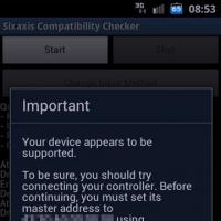
Good day, friends. An interesting solution for clicking on an icon that will not annoy visitors. In it you can place either important announcements or other necessary information. It will appear only when the user clicks on the icon (in my case, the Android icon).
The code is absolutely not complicated, without any libraries or heavy scripts. And it installs easily into the HTML/JavaScript gadget. The picture itself and the "close" button in svg format. You can clearly see this “design” on the test blog in the upper right corner.
DemonstrationAll code
Greetings, you
blog cheat sheets for bloggers about creating, settings, design and blogging on the BLOGGER platform I hope that you will find a lot of useful and interesting information here. I will be very glad to see your feedback
.app-android-outer (
width: 50px;
position: fixed;
top: 0;
right: 50px;
z-index: 9999
}
.app-android (
width: 50px;
height: 55px;
line-height: 55px;
margin: 0;
text-align: center;
position: relative;
float: right;
cursor: pointer
}
.app-android svg (
vertical-align: middle;
opacity: .7
}
.app-android:hover svg,
.app-android:focus svg,
.app-android:active svg (
opacity: 1
}
.app-android:before (
content: "";
position: absolute;
top: 0;
bottom: 0;
left: 0;
right: 0
}
.app-content (
background: #fff url(https://2.bp.blogspot.com/-sSuAXU_yhVM/XPD3sxcQ8DI/AAAAAAABK4s/CusSSD-sJf8k_B6AuUkF4g5nkmivM6MEACLcBGAs/s300-rw/android-4.png ) no-repeat bottom left;
width: 300px;
padding: 0;
border: 1px solid #ccc;
border-color: rgba(0, 0, 0, .2);
line-height: 1.3;
-webkit-box-shadow: 0 2px 10px rgba(0, 0, 0, .2);
box-shadow: 0 2px 10px rgba(0, 0, 0, .2);
outline: 0;
position: absolute;
right: 50%;
top: 50px;
margin-right: -40px;
-webkit-border-radius: 2px;
border-radius: 2px;
-webkit-user-select: text;
z-index: 2;
display: none;
}
.app-content h3 (
margin: 0;
padding: 5px 20px;
color: #333;
font-size: 18px;
font-weight: 700;
border-bottom: 1px solid #ccc;
border-color: rgba(0, 0, 0, .2)
}
.app-content-on (
padding: 10px 20px 16px;
color: #333;
font-size: 16px;
font-weight: 400
}
.app-content-on svg (
vertical-align: -7px;
}
.app-content:before (
content: "";
border-color: transparent;
position: absolute;
right: 0;
margin-right: 30px;
z-index: 1;
height: 0;
width: 0;
border-bottom-color: #ccc;
border-bottom-color: rgba(0, 0, 0, .2);
top: -9.5px
}
.app-content:after (
content: "";
border-color: transparent;
border-bottom-color: #fff;
border-style: dashed dashed solid;
border-width: 0 8.5px 8.5px;
position: absolute;
right: 0;
margin-right: 30px;
top: -8.5px;
z-index: 1;
height: 0;
width: 0
}
.app-close-button(
position: absolute;
width: 18px;
height: 18px;
line-height: 28px;
text-align: center;
top: 7px;
right: 5px;
background: 0 0;
border: none;
cursor: pointer;
padding: 0
}
.app-close-button:before (
content: "";
position: absolute;
top: -15px;
right: -15px;
bottom: -15px;
left: -15px;
cursor: pointer
}
.slideInUp(
-webkit-animation-name: slideInUp;
animation-name: slideInUp;
-webkit-animation-duration: 1s;
animation-duration: 1s;
-webkit-animation-fill-mode: both;
animation-fill-mode: both
}
@-webkit-keyframes slideInUp (
0% {
visibility: visible
}
100% {
transform: translateY(0)
}
}
@keyframes slideInUp (
0% {
-webkit-transform: translateY(100%);
transform: translateY(100%);
visibility: visible
}
100% {
-webkit-transform: translateY(0);
transform: translateY(0)
}
}
@media screen and (max-width:960px) (
.app-android-outer (
right: 80px
}
}
@media screen and (max-width:375px) (
.app-content (
margin-right: -75px
}
.app-content:after,
.app-content:before (
margin-right: 65px
}
}
@media screen and (max-width:320px) (
.app-content (
margin-right: -95px
}
.app-content:after,
.app-content:before (
margin-right: 85px
}
}
Copy the entire finished code and install it in the HTML/JavaScript gadget anywhere in your blog layout. The icon will be located exactly in the place as intended. The line marked in gray contains a translucent background image of the pop-up window itself. If unnecessary, you can remove it from the code and set the preferred main background to your taste by changing the value of background: #fff to the desired one.
Thanks everyone for your attention. See you.
subscribe to new cheat sheets
Hello friends. I want to show how very easy it is to change the general background of the entire blog. Although the background itself can be easily customized in the Theme section. There you can select ready-made backgrounds or upload your own picture and make the appropriate settings. However, I decided to offer you an easier option, in my opinion. Here we can adjust the size of the background image ourselves. Or rather its width.
Let's get down to business. Initially, my test blog looked like this. I marked the space (or the background of the entire canvas) that was specified in the theme settings.

Now we will change it to this picture

To make it look something like this

Here I want to draw your attention. The width of the blog in my case is 1200 px. The dimensions of the background image are 1450 by 950 px. The picture completely filled the entire space.
If the size of the background image is smaller than the size of the entire blog canvas, then it will not cover the entire space and will look like a border. See the difference

It seems to be quite acceptable too. Some people decorate websites this way for the holidays. In any case, let's consider both options. With a correctly selected background or created in any editor, both options can be adjusted.
No special skills required.
1. Select the desired picture and copy its address.
2.Copy the code below and set the address of your image
3. Go to the Theme - Edit HTML tab, find ]]> and install the finished code above this line.
The result will be visible when viewing the topic. If you are satisfied with it, feel free to click save and admire the new template.
I'll repeat it again. In case the image turns out to be smaller than the width of the blog or is completely hidden out of sight, you need to set the width value in the code. Add just one line and it looked like this
body(
background: url(http://www.clipartbest.com/cliparts/9iz/EnR/9izEnR56T.png)
no-repeat top fixed ;
background-size: 100%;
}
With background-size value: 100%; you can play around, changing it to a smaller one until you achieve what you want.
With such simple manipulations you can create different backgrounds for different holidays, seasons or your mood.
Perhaps you missed it
All the best and see you soon.
Hi all. Today I will offer you a code that makes a picture appear when you hover over a link. There are a lot of options for designing links. But this one will be an original solution for thematic blogs. Or to create a separate message. You can always choose a picture to suit the desired theme and design.

You can see the live demo immediately below. I provided links to some pages of my blog for clarity. You will, of course, change them to your page addresses. Pictures and text - respectively.
Here is the code itself.
Dear "link text" readers, Happy New Year 2020 link text. Let it begin with a new takeoff Towards better heights in life And a good bank account link text Bring harmony in business, A lot of happiness in your personal life!
.stage(
display: table-cell;
vertical-align: middle;
}
.tabled, .middled (
text-align: center;
margin: 0 auto;
}
.jumbo(
font-size: 150%;
vertical-align: -25px;
transform: rotate(8deg);
}
.jumbo:first-child (
-webkit-animation: wave 10s infinite ease;
animation: wave 10s infinite ease;
}
.jumbo:last-child (
-webkit-animation: wave 15s infinite ease;
animation: wave 15s infinite ease;
}
@keyframes wave (
0% ( transform: rotate(8deg); )
25% ( transform: rotate(15deg); )
75% ( transform: rotate(-10deg); )
100% ( transform: rotate(8deg); )
) @-webkit-keyframes wave (
0% ( -webkit-transform: rotate(0deg); )
50% ( -webkit-transform: rotate(10deg); )
100% ( -webkit-transform: rotate(0deg); )
}
p(
font-size: 110%;
font-family: Helvetica, sans;
max-width: 24em;
margin: 0 auto;
text-align: justify;
color: #00695C;
font-weight: lighter;
line-height: 1.5em;
}
a (
color: #ccc;
text-decoration: none;
border-bottom: solid thin #f7901d;
}
a:hover (
color: #f7901d;
}
.boo (
position: relative;
}
.boo:before, .boo:after (
position: absolute;
transition: all 0.15s ease;
}
.boo:before (
top: -75px;
left: -70px;
-webkit-transform:rotate(0deg) scale(0);
-moz-transform:rotate(0deg) scale(0);
-o-transform:rotate(0deg) scale(0);
-ms-transform:rotate(0deg) scale(0);
transform:rotate(0deg) scale(0);
}
.boo:after (
top: -115px;
right: -70px;
-webkit-transition-delay: 0.05s;
transition-delay: 0.05s;
-webkit-transform:rotateY(180deg) scale(0);
-moz-transform:rotateY(180deg) scale(0);
-o-transform:rotateY(180deg) scale(0);
-ms-transform:rotateY(180deg) scale(0);
transform:rotateY(180deg) scale(0);
}
.boo:hover:before (
top: -140px;
-webkit-transform:rotate(15deg) scale(1);
-moz-transform:rotate(15deg) scale(1);
-o-transform:rotate(15deg) scale(1);
-ms-transform:rotate(15deg) scale(1);
transform:rotate(15deg) scale(1);
}
.boo:hover:after (
-webkit-transform:rotateY(180deg) scale(0.7);
-moz-transform:rotateY(180deg) scale(0.7);
-o-transform:rotateY(180deg) scale(0.7);
-ms-transform:rotateY(180deg) scale(0.7);
transform:rotateY(180deg) scale(0.7);
}
.boo:before, .boo:after (
content: url("link to image. png");
}
Copy the entire code and do required settings and set it in the message editor in HTML mode at the desired location. The example contains 3 links. In any case, you can remove or add a line like this
"link text")
And with all my heart I would like to wish you all a very happy New Year. Smiles, joy, health, prosperity to family and friends. Goodness and peace to your home!!!
HAPPY NEW YEAR 2020, EVERYONE!!!
Hi all. Navigation in standard Blogger templates does not attract any attention at all. Not everyone will notice the barely noticeable panel at the end of the page. Therefore, any new visitor may not see the link to previous or next blog articles.
There are a lot of navigation styles. But this is not the first time they have been told that many of them were “ordered to live long.” And site navigation is perhaps the most basic element. Therefore, I will provide links to articles where I have already published navigation design options and offer another working code. This is what it will look like under the blog posts.
Today's version looks quite elegant. Displays a numbered list of pages in the panel and displays the previous and next pages correctly.
To install, you first need to copy this code
//1J "+i+\" 1H \"+g+"";7 1f=L(i)-1;5(i>1)(5(i==2)(5(l=="s") (6+=\" \"+Q+\"\")e(6+=\" \"+Q+\"\"))e(5(l=="s")(6+=\" \"+Q+\"\")e(6+=\" \"+Q+\"\")))5(E>1)(5(l=="s")(6+=\" 1\")e(6+=\" 1\"))5(E>2)(6+=\"...\")1m(7 m=E;m